Set two panels side by side. On one — a holy face, gold, no shadow, no depth, as if space had been cancelled. On the other — a room, a window, light settling on a cheek, and you can feel where the table ends and the air begins. Between them lie not five centuries of skill. Between them lies a change in the one who looks.
The flatness of the icon is not poverty of the hand but a decision of consciousness.
We are used to thinking in a straight line: first they painted badly, then they learned. The icon is childhood, the Renaissance is maturity, and after that — steady progress. It is a convenient story, and it lies. The icon painter was no less able. He simply did not want what we want. He had no need of depth, because he was painting not a place but a state. And a state has no square footage.
Light that does not fall
Start with the strangest thing — the gold. The background of an icon is gold not because the artist loved luxury. Gold is not a colour and not a surface. Gold is the absence of space and time. Where the face stands there is no morning and no noon, no north and no south. Remove the gold, paint in sky and earth — and you instantly place the saint into a moment, tie him to an hour and a location. And he cannot be tied: he is in eternity, and eternity is never somewhere. It is everywhere at once.
Hence the light. Look closely at an icon and you will find no source. There is no shadow, because the light does not come from the side, from a window or the sun. The light comes out of the faces themselves, from within. In other words: in our world a thing is visible because light falls on it — it is passive, it receives. In the icon it is the reverse: the face shines by itself; it is a source, not a screen. And that is a precise image of how consciousness works. You, too, do not reflect the world — you illuminate it with what is in you. Wherever you direct your attention, that is what comes into being. The icon simply painted this law in pigment: light goes from the centre outward, not from outside in.
Reverse perspective: it is not you looking at the icon
Now for the flatness, properly. The icon has its own geometry, and it is turned inside out. Take a table in an icon — its far edge is wider than the near one. The lines do not converge in the distance, behind the saint’s back; they spread apart and converge here, in front of the panel, where you stand. This is called reverse perspective, and it is usually written off as naivety. There is zero naivety in it. It is a statement.
The meaning is direct: the vanishing point is not in the depth of the picture but in you. You are not examining the icon from outside — it is looking at you, and the lines converge in your pupil. You are not a spectator in front of a stage; you are a participant drawn inside. Think of the mirrors in a barber’s shop: two mirrors facing each other, and a corridor of reflections runs off to infinity. Direct perspective puts that infinity behind the canvas, far away from you. Reverse perspective turns the corridor around and aims it into you. The icon is not a window you peep through into another world. The icon is a door, and the one standing in it is you.
The icon does not depict — it addresses. It needs flatness in order to look back.
That is why there is no volume. Volume would separate the saint from you, would set him inside his own box of space, behind glass. The task is the opposite: to remove the glass, to draw two worlds together into a single point — into the one who stands in the presence. Flatness here is more honest than depth. Depth divides; flatness joins.
The vanishing point moves into man
And now — the shift we call the Renaissance. Giotto, at the start of the fourteenth century, was the first to give figures weight and shadow, to put the ground back under their feet. A hundred years later Brunelleschi in Florence builds linear perspective as an exact system: all lines converge at a single vanishing point on the horizon. And this is not the invention of a drawing device. It is the relocation of the centre of the world.
Watch what happened to that point. In the icon it was in the viewer, in the one standing in the presence, in the living person. In linear perspective it moved to the horizon, into the depth of the picture, into geometry. The world received a single centre — and that centre became the eye of an observer standing in the correct spot. Man stepped into the middle and said: from here, everything is seen truly. Before, truth came from there — from eternity, from the gold. Now it comes from here — from my pupil, from this hour.
Give man that point of view and the rest follows by itself. Shadow appears — and with it the time of day, and with that a particular day. Depth appears — and with it a place, a room, a city. Gods become ever harder to paint: you cannot put them in a room with a window, cannot give them seven o’clock in the morning. But the thing — the thing blossoms. A century and a half later the Dutch painters of the seventeenth century will paint a jug of milk, a piece of bread, light on a copper basin with the same seriousness once reserved for the holy face. The sacred came down from the wall into the room and sat at the table.
Notice: this is not about brushes or oils. First the centre shifted within — from eternity into man, from I stand in the presence to I look. Only after that did the hand learn depth. Technique is always invented to serve a state that has already ripened, not the other way round. Flatness and volume are not two grades of mastery. They are two answers to the question «where do I stand in relation to the world». The icon answers: I am inside, and the world looks at me. The Renaissance answers: I am at the centre, and the world opens to me.
The icon is flat because it looks at you. The painting has depth because you are the one looking.
So do not ask which panel is «more correct». Ask — why. Flatness was needed by a person who wanted to stand before eternity and be seen. Depth was needed by a person who wanted to step into the centre and see for himself. Both answers are true; they are simply the answers of different people — or rather, of one human being in different ages of his soul. Painting did not improve from the icon to perspective. It turned its pupil: first the light came into us, then we aimed it outward. And the whole history of the gaze is the story of where man decided, this time, to place the vanishing point.
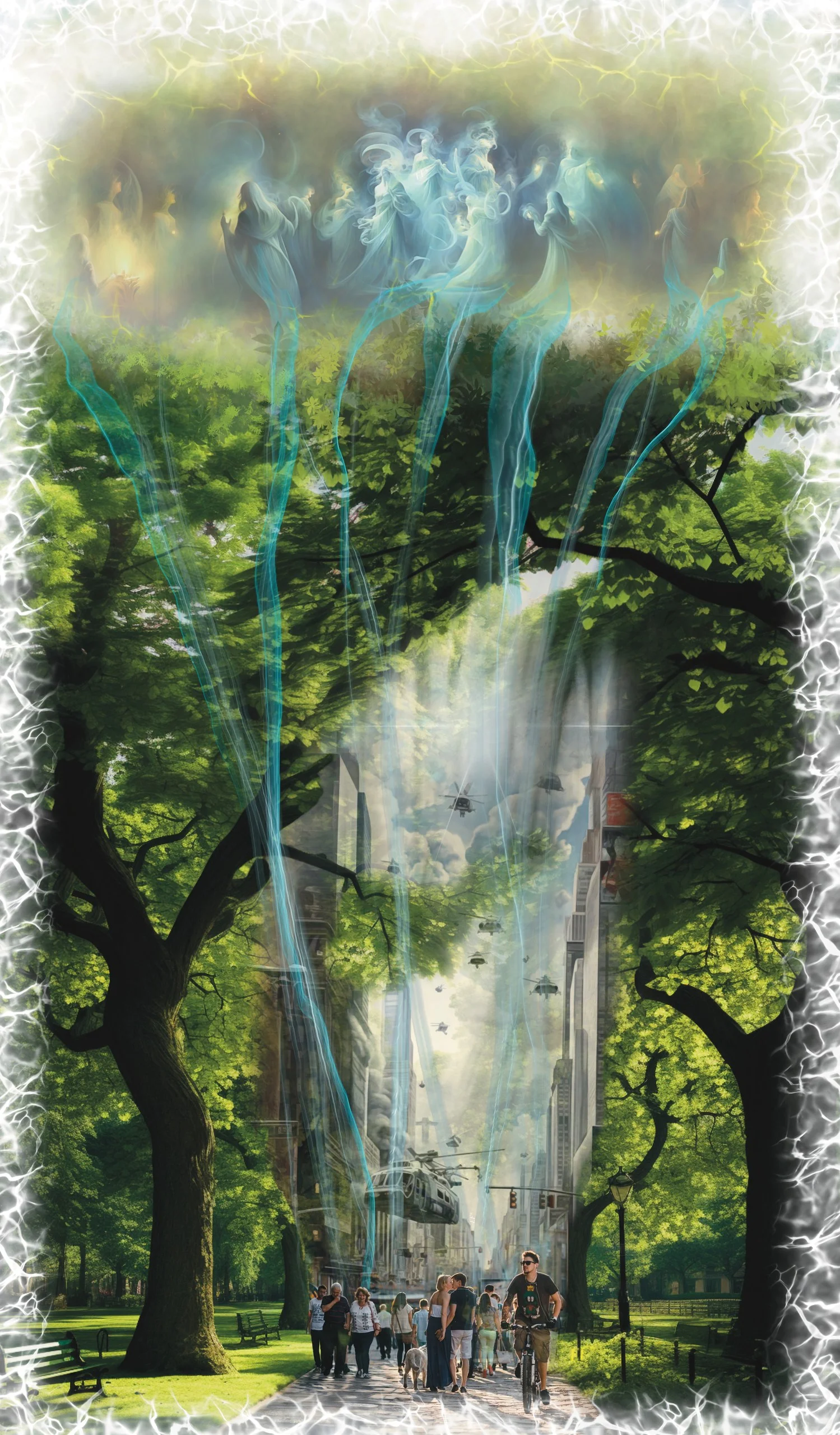
The painting on the cover — «The Spiritual and the Physical World» →
— Evgeny Fleysher
Artist and engineer. Author of WHY? and The Spiritual Alphabet, creator of the Art as Healing project. Paints works built on sacred geometry.
About the author and the method →