Say “blue”, and it will seem you have named a thing: the sky, the sea, paint in a tube. Physics sees it differently. Outside, in the world beyond you, there is no blue and no red — there is an electromagnetic wave, and the wave has a length and a frequency. A wave of roughly 450–490 nanometres enters the eye — and you say “blue”. A wave of 620–750 nanometres — and you say “red”. Colour does not lie on the object like dust. Colour is the work of the brain, its translation of frequency into the language of sensation. In other words: the painting hangs on the wall, but the painting happens in you.
Outside there is a wave. Blue begins inside.
This is worth saying slowly, because everything else grows from it. An object does not “radiate blue” — it merely reflects part of the light spectrum and swallows the rest. A blue patch on a canvas is a filter, a sieve for light. Which means the artist laying down that patch is not really colouring a surface — he is tuning a stream of frequencies that in a minute, in a year, in a hundred years will enter someone’s eye and become a state. Paint is a way of sending a wave into the future.
Think of radio. In the room where you are sitting there are, right now, dozens of stations: news, a symphony, someone’s conversation. You do not hear them — not because they are not there, but because you have no receiver tuned to their frequency. Switch one on, turn the dial — and out of the emptiness comes music that was here all along. The eye is the same kind of receiver, only very narrow: out of the whole ocean of electromagnetic waves it catches the tiny band we call visible light. The world you see is not the whole world but the slice of it you were tuned to at birth. And within that slice, every colour is its own station.
The paradox of the cold wave
Now the paradox that made this worth beginning. The shorter the wave, the higher the frequency. Blue is shorter than red, which means blue is faster: its wave oscillates more often, and each of its quanta carries more energy. In physics, blue is the most excited edge of the visible spectrum, red the slowest. In sensation it is the other way round: red we call hot and anxious, blue cold and calm. The fastest wave reads to us as the quietest. Why?
The honest answer: nobody fully knows. There are studies linking blue tones and bluish light with a slower pulse and relaxation; there are studies where the effect is weak or fails to repeat. So “blue calms” is not a law of nature but a stable probability. What does exist is a cultural layer older than any laboratory: blue is what was always far away and never attacked. The sky you cannot reach. Water at depth. Distance where the air eats away the contours. Red is blood, fire, ripe fruit — what is near and demands action. Blue is what can only be looked at. Perhaps the calm of blue is the memory of the species: for thousands of generations blue meant “that is far off, you may exhale”. Red calls you to act — blue permits you to be.
Notice how the phrase “cold colour” is itself built. Cold is not a separate substance; cold is the absence of heat — physics says the same. Calm is built the same way: it is not something blue puts into you but something it does not pull out of you. Blue does not tug at the ancient levers of alarm — and in the silence that frees up, you finally hear yourself. It is not the colour that calms. It is the pause the colour leaves.
Kandinsky: colour that sounds
Of all painters, Kandinsky went furthest in this direction. In “Concerning the Spiritual in Art” (1911) he writes about colour literally as sound: colour is a vibration that calls up an answering vibration of the soul; every colour has its own instrument and its own timbre. Yellow, for him, is a shrill trumpet, a sound that advances on the viewer. Blue is movement inward and away from the viewer: the darker it grows, the lower the sound — from a light flute through a cello to a dark organ. He was not decorating his text with metaphors. He seriously believed that the artist presses a key and the string is stretched inside the human being. One can argue about how much of this is science — Kandinsky never claimed a laboratory. But notice: he described exactly the mechanism we spoke of above, only from the other side. The physicist says “wavelength”; Kandinsky says “inner sound” — and they are talking about the same thing: colour does not depict. Colour acts.
Look what this changes. If colour is frequency, and frequency changes the state of whoever stands in it, then a painting stops being a picture and becomes an instrument. A tuning fork is simple: strike it and hold it near a second one — the second will sound by itself, untouched, only because the frequency matches. The artist does the same. He cannot send you his state directly — but he can leave on the canvas the set of frequencies that state lived in. And if you stand before the canvas and do not hurry, the same thing will answer in you. Not something similar — the same.
A painting is a tuning fork. It is not the canvas that sounds — it is you.
What to do with this
Test it on yourself — it is the most accessible experiment there is. Find a large blue: the upper reach of an evening sky, the sea to the horizon, a blue canvas in a museum — and look longer than is comfortable. A minute. Two. At first it will be boring: the mind is used to looking as identifying-and-moving-on. Then there will be nothing left to identify — and the looking itself will begin. Your breath will lengthen on its own; you will not be lengthening it. This is not mysticism — it is tuning to a frequency that demands nothing of you. The way a house grows quieter when the fridge switches off: you did not know it was humming until the hum stopped.
And then ask not “what do I see” but — why. Why this colour crossed your path now, why you stopped precisely here. Attention creates: you gradually become what you look at for a long time. A person surrounded by shouting begins to shout inside, even when silent. A person who stands in blue for a couple of minutes a day carries a little distance with him. That, in essence, is the whole psychology of colour, cleaned of the tables that say “what each colour means”: it is not the colour acting on you — you enter its frequency the way you enter water, and the water does not ask about your beliefs.
Blue is not promised to you as a remedy. It does not calm everyone, or always — and that is honest, because truth is one, but each person’s felt truth is their own. Yet the very possibility — that a wave reflected off a piece of painted canvas can, without a single word, change your state — is worth remembering every time you walk into a room of paintings.
Colour is frequency. And frequency is always a question: what are you willing to coincide with.
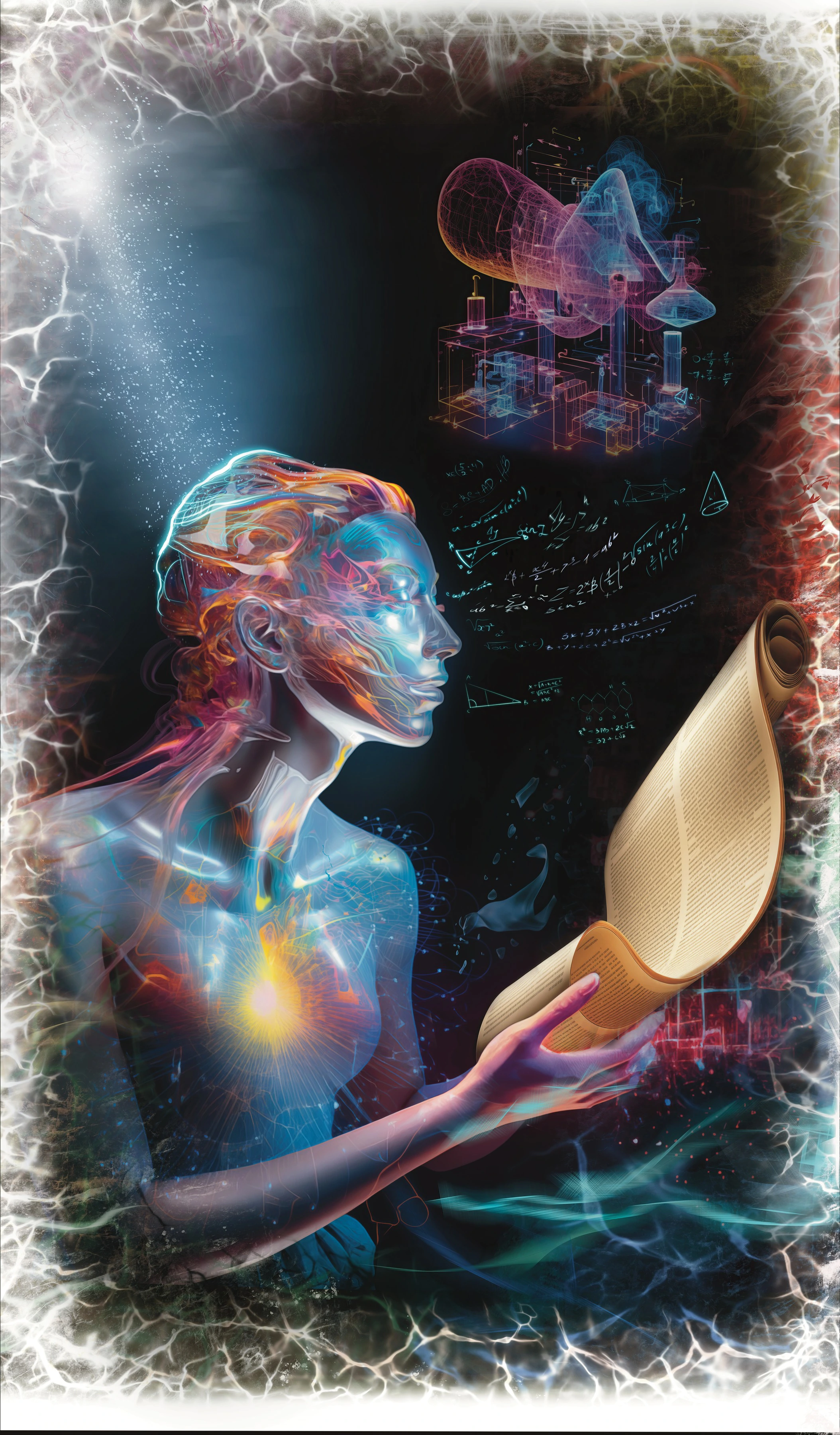
The work on the cover — “Mind and Consciousness” →
— Evgeny Fleysher
Artist and engineer. Author of WHY? and The Spiritual Alphabet, creator of the Art as Healing project. Paints works built on sacred geometry.
About the author and the method →